Image

ICPL Teen Minecraft Meetup

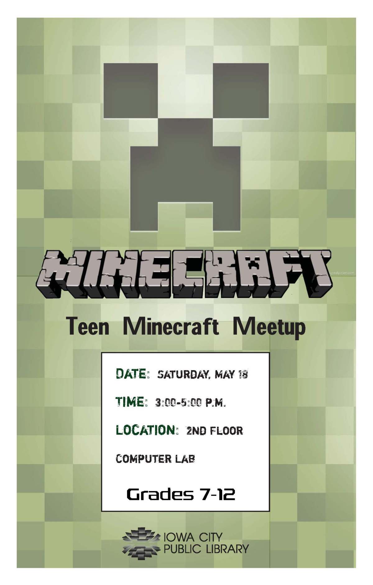
This is a poster that I created recently in both a standard 8.5″ x 11″ format as well as the one displayed here, which is 11″ x 17″. The task was to create a poster promoting the upcoming ICPL teen event, “Minecraft Meetup”. Personally, I had no idea what Minecraft was or what the game was all about. A quick google search and a little research later, I learned that the game is more or less a free-for-all. You have cubes and can build anything you would like out of them and interact with other players- but watch out for monsters!

The most notable creatures in the game are tall, green “Creepers”, which are said to have a penchant for destroying everything you’ve built up in the game before their arrival on the scene. Because they are so easily identifiable (and bold!), I chose to make the bulk of the poster look like a Creeper. To keep it from looking too intense or busy, I took the image of a Creeper and made its opacity around 55%. After sizing this image to fit the top of the page, I cropped and re-placed the bottom half (just the green squares- no “eyes”) to fill in the rest of the poster. I then layered the Minecraft logo on top and chose a font for the event information that went with the choppy, ‘boxy’ feel of the logo. I put the date/time/location information in a white square (cubes are what the entire game is based on, after all) so that it would stand out against the green background. Add the ICPL logo at the bottom, and this poster was done!Teen Minecraft Meetup 11x17
Image

ICPL Storytime Tips For Parents

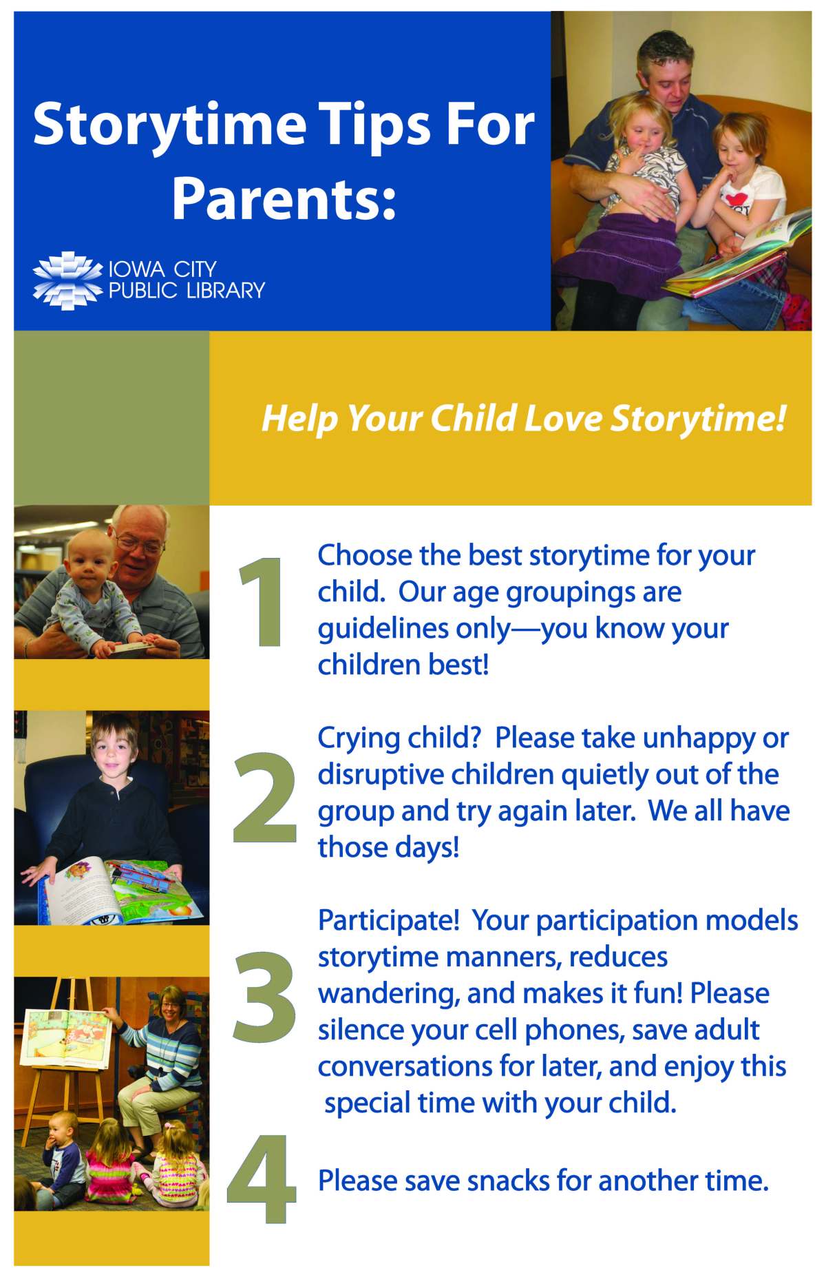
After completing the first storytime tips poster, the Children’s department at the ICPL requested that we print off a much larger version that parents could easily read at a glance. The final size was determined to be 3′ 8″ x 3″, but at that size, my original poster images would be too pixelated. To address this, we decided that I would re-create an entirely new poster and this time make it fit more with the branding of the rest of the library departments. I looked through some of the library’s pamphlets, posters, and other documents to get a feel for how this poster should look. Streamlined, bold, and of course, using the designated “library colors”- specific hues of blue, red, yellow, and green. After also selecting some high quality photos (that would retain clarity on a large scale) and finalizing the layout I wanted, this is what I came up with. Storytime Tips for Parents large scale version

ICPL Money Smart Week Poster

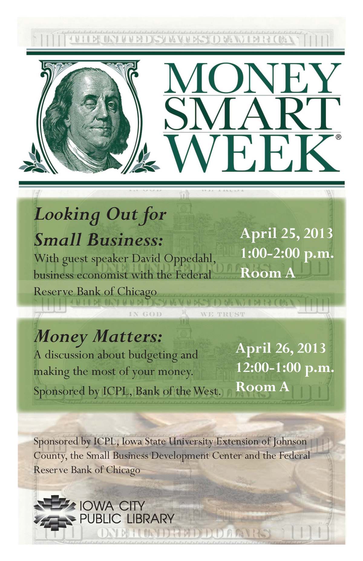
This is a 11″ x 17″ poster I created for the “Money Smart Week” event at the ICPL coming up next month. Included in the events are several seminars and lectures that are open to the public. To entice people to attend these events, I wanted to make the poster eye-catching and straight to the point. Because the events are obviously focused on money, I went with the most straightforward graphics I could find. I first layered images of the back of a $100 bill as the background (13% opacity). I then added a similar opacity image of coins to the bottom of the poster and layered the text and colored blocks on top of the money layers. The “Money Smart Week” graphic is the logo of the events and was prominently placed at the top of the poster. money smart week sign JPEG